Critical Development

Language design, framework development, UI design, robotics and more.

Archive for the ‘Custom Controls’ Category

Advanced Customization of a Silverlight ListBox

Posted by Dan Vanderboom on April 13, 2009

[This article and its solution are based on Silverlight 3 Beta and Blend 3 Beta.]

The more I work with Silverlight, the more impressed I am.  Though I do keep running into frustrating situations, I haven’t encountered nearly as many dead ends as I did writing Windows Forms applications.  But where I used to run into dead ends, I now find myself lost in a labyrinth of deeply-composed control hierarchies, dichotomized content controls, and numerous interrelated control and data templates.

But ultimately I can find a way to do what I set out to do.  That’s huge.  If the learning curve is treacherously steep and my solution to a problem is tricky and twisted, I can reassure myself of more fluent UI design in the future due to increased understanding.  The difficulty of solving these problems is due to complexity of the UI design itself, the immaturity of Silverlight and its APIs, and my own inexperience working with it.

You can download the finished solution here.

The Goal

When I set out to customize a list control, I didn’t start with the tools of Silverlight.  I sketched out a design that assumed anything would be possible, and decided to figure out later how to implement exactly that (in behavior and layout, not final visuals).  The mock-up below is similar to what I came up with, simplified to include only those elements I’m going to illustrate in this article.

image

The first thing you’ll notice is that the data template renders differently based on the data for that item.  I found a Code Project article by Anil Gupta on doing the same kind of thing.  This turns out to be the easy part.  (The space around and between items isn’t intended to be rendered as such, and was added only to emphasize the separate identities of the item templates.)

I also wanted each item in the list to be expandable to display more information and to host interactive controls like sliders (shown in the example) to manipulate the underlying data.  In noticing that this button and behavior, as well as the border, are common elements to each of the item templates, I decided that what I was looking at involved a ContentControl.  This new control would contain these common elements and a ContentPresenter which would be filled by the specific item type template (one for airplane, one for truck, one for boat).  That way, I could build a whole bunch of new templates for new item types and I wouldn’t have to worry about placing the button correctly or wiring up its behavior each time.

Though the illustration might suggest that the only difference among the templates is background color, I wanted to be able to completely differentiate them.  The only thing that would be standard would be a collapsed height of 32 to give a nice consistent vertical layout (and for this example, a standard expanded height of 64).  Inside, the controls and their layout could follow any design.

Unspecified at first, one of my presumptions was that the width of each item would fill all of the available space, which is the width of the ListBox minus borders, padding, and the vertical ScrollBar.  This would prove to be the most difficult challenge, and I found some discussion in the forums, but ultimately I would find my own way to solve it.

Finally, I wanted to do as much as possible in Blend.  XAML is fine for setting complex bindings and wiring up other things, but for drawing of graphics (editing templates), I wanted to leverage Blend as much as possible.

The Solution

First we need a data model, to know the shape of items that we’re binding to in our ListBox.  I used a simple example of a Vehicle base class and three derived types.  Elsewhere, I instantiate several of each type of vehicle and add them to the ListBox’s ItemsSource collection.

public abstract class Vehicle
{
    public string Manufacturer { get; set; }
    public string Model { get; set; }
    public double Price { get; set; }
}

public class Truck : Vehicle
{
    public bool HasFourWheelDrive { get; set; }
}

public class Boat : Vehicle
{
    public double HullWidth { get; set; }
}

public class Airplane : Vehicle
{
    public int MaxAltitude { get; set; }
}

I then created three UserControls, one for each vehicle type, and called them AirplaneTemplate, BoatTemplate, and TruckTemplate.  I gave each of them a DesignHeight of 64 to represent their expanded state, let their Width be Auto, and set HorizontalAlignment to Stretch.  I set the Height of each of the two Grid rows to 32, to ensure they wouldn’t stretch as the ContentControl hosting this content collapsed.

image

Selecting a Template Based on Item Data

There’s no way that I know of to write an expression in XAML that will bind to a different data template based on item data.  I also know of no way to write code behind a data template.  To get around these limitations, I created a data template called VehicleListDataTemplate that contains a single VehicleItemTemplate custom control which I could write code behind.  This control is a ContentControl, so it’s capable of drawing its own content as well drawing content passed into it.  The content that it supplies itself consists of the common UI elements: the border and the button to toggle the expansion or collapse of the item.

This control is mocked up like so, showing both collapsed and expanded states:

image

The control’s ContentPresenter, set with its Content property, would occupy the same space, although the button would be placed on top to ensure it was clickable.

This was my first custom Silverlight control (other than UserControls), so several things were new to me.  For one, defining a default control template in generic.xaml and writing a separate class file for behavior.  This is what the default template looks like:

<Style TargetType="local:VehicleItemTemplate">
    <Setter Property="Template">
        <Setter.Value>
            <ControlTemplate TargetType="local:VehicleItemTemplate">

                <Grid x:Name="Core" Background="{TemplateBinding Background}"
                      d:DesignHeight="32" Height="{TemplateBinding Height}"
                      d:DesignWidth="312" Width="Auto"
                      VerticalAlignment="Stretch" HorizontalAlignment="Stretch">

                    <Border VerticalAlignment="Stretch" CornerRadius="5,5,5,5"
                            BorderBrush="{TemplateBinding BorderBrush}" BorderThickness="2" />

                    <ContentPresenter
                        VerticalAlignment="{TemplateBinding VerticalContentAlignment}" 
                        HorizontalAlignment="{TemplateBinding HorizontalContentAlignment}" 
                        Content="{TemplateBinding Content}"
                        ContentTemplate="{TemplateBinding ContentTemplate}" Margin="0"/>

                    <Button x:Name="Expander" VerticalAlignment="Top" HorizontalAlignment="Right"
                            Margin="0,4,4,0" Width="28" Height="24" 
                            BorderBrush="{TemplateBinding BorderBrush}"/>
                </Grid>
                
            </ControlTemplate>
        </Setter.Value>
    </Setter>
</Style>

And here it’s referenced by the data template:

<DataTemplate x:Key="VehicleListDataTemplate">
    <local:VehicleItemTemplate VerticalAlignment="Top" HorizontalAlignment="Left"
        Background="#0014145D" Margin="0,0,0,0" BorderBrush="#FF5063A5" 
        d:DesignHeight="32" Height="32" d:DesignWidth="430"
        VerticalContentAlignment="Stretch" HorizontalContentAlignment="Stretch" />
</DataTemplate>

So far that’s not too bad.  We have a data template, which refers to VehicleItemTemplate (a ContentControl) that gives our common appearance and hosts a specific vehicle UserControl depending on the item data in question.  I count three layers so far, but unfortunately that isn’t enough.

Let’s take a look at how we set the content:

private void VehicleItemTemplate_Loaded(object sender, RoutedEventArgs e)
{
    var vehicle = DataContext as Vehicle;

    // vehicle will be null when this is executed in the designer
    if (vehicle == null)
        return;

    if (vehicle is Airplane)
        Content = new AirplaneTemplate();
    else if (vehicle is Truck)
        Content = new TruckTemplate();
    else if (vehicle is Boat)
        Content = new BoatTemplate();
}

Pretty simple: the DataContext is our item data object, we can inspect the type to figure out which one it is, and create a new vehicle UserControl of the appropriate matching type to set the Content.

To make it expand and collapse, we first need to get a reference to the button in our template, which is based on the parts I defined for the control.

[TemplatePart(Name = "Core", Type = typeof(FrameworkElement))]
[TemplatePart(Name = "Expander", Type = typeof(ButtonBase))]
public class VehicleItemTemplate : ContentControl

In the template, the Expander part must be some control that inherits from ButtonBase, and which therefore implements a Click event.  When the template is applied to the control at runtime, OnApplyTemplate is run, so we hook into that event there:

public override void OnApplyTemplate()
{
    base.OnApplyTemplate();
    ToggleButton = GetTemplateChild("Expander") as ButtonBase;
    ToggleButton.Click += new RoutedEventHandler(btnToggleSize_Click);
}

private void btnToggleSize_Click(object sender, RoutedEventArgs e)
{
    Duration duration = new Duration(TimeSpan.FromSeconds(0.2));

    Storyboard sb = new Storyboard();
    sb.Duration = duration;

    DoubleAnimation ani1 = new DoubleAnimation();
    ani1.Duration = duration;
    ani1.To = Height == 32 ? 64 : 32;
    Storyboard.SetTarget(ani1, this);
    Storyboard.SetTargetProperty(ani1, new PropertyPath("FrameworkElement.Height"));

    DoubleAnimation ani2 = new DoubleAnimation();
    ani2.Duration = duration;
    ani2.To = Height == 32 ? 64 : 32;
    Storyboard.SetTarget(ani2, Content as Control);
    Storyboard.SetTargetProperty(ani2, new PropertyPath("FrameworkElement.Height"));

    sb.Children.Add(ani1);
    sb.Children.Add(ani2);

    sb.Begin();
}

Now we have an animation that will smoothly expand or collapse our item and its content, and because I use the To property, we avoid jumping from one state to another.  Instead, if we click to expand and then click to collapse again, it will animate from its current position to the desired position.

Setting the Correct Width of ListBox Items

The biggest problem I had was in setting the correct width.  With all Widths set to Auto, each item in the list will take up only as much space as it needs.  They can be shorter or longer than the ListBox’s width, and each item could be rendered a different width (depending on the template).

The first thing I tried was to set the VehicleItemTemplate’s Width to the ActualWidth of the ListBox.  I didn’t have enough items in my list to see the vertical ScrollBar appear, but even without it, the borders of my item templates were being clipped by the right side of the ListBox, and I could see a gap of several pixels to the left as well as above and below each item.

image

With the default rendering of Silverlight being that nothing is drawn (border widths are zero, brushes are null, etc.), I find it odd that the ListBox assumes I want padding where I haven’t specified any.  After all, if I wanted this, couldn’t I add a Margin to my data template?

I removed the ListBox border, and finally added a ListBoxItem manually to the ListBox in Blend.  Right-clicking on that ListBoxItem, I edited a copy of the control template, shown in the screenshot below:

image

This turns out to be different from the data template defined earlier.  This ListBoxItem template is itself a ContentControl, and its content is my VehicleListTemplate… (which is another ContentControl that hosts the specific vehicle UserControls…).  See how confusing this can get?  I feel like Alice in Wonderland sometimes, seeing how far the Silverlight hole really goes.  I also wonder why there doesn’t appear to be any way to edit this template without manually creating a ListBoxItem, when it clearly matters even when you’re defining a data template.

It’s also in this ListBoxItem template that you can render visual decorators to indicate various visual states: Normal, MouseOver, Pressed, and so on.  You might expect to handle that in your data template, but that doesn’t seem to be the case.

Anyway, within that ListBoxItem template was this ContentPresenter.

<ContentPresenter x:Name="contentPresenter" 
                  HorizontalAlignment="{TemplateBinding HorizontalContentAlignment}" 
                  Margin="{TemplateBinding Padding}" Content="{TemplateBinding Content}" 
                  ContentTemplate="{TemplateBinding ContentTemplate}"/>

The third line shows a Margin being bound to the Padding property.  I removed this Margin altogether, and the gratuitous extra space around my items disappeared, making me happy.

Once you have this custom ListBoxItem template, you need to do two things:

  1. Delete the ListBoxItem you manually added in Blend.  Otherwise you’ll get an error when trying to set the ListBox’s ItemsSource property.
  2. Set the ItemContainerStyle property of the ListBox to point to this new template.  Note that this is different from the ItemTemplate property which sets the data template.

The ListBox XAML should now look something like this:

<ListBox x:Name="VehicleList" HorizontalAlignment="Stretch"
         Margin="20,20,20,20" Width="Auto"
         BorderThickness="2,2,2,2" BorderBrush="#FF99A712"
         ItemTemplate="{StaticResource VehicleListDataTemplate}"
         ItemContainerStyle="{StaticResource ListBoxItemStyle}">
    <ListBox.Background>
        <LinearGradientBrush EndPoint="0.5,1" StartPoint="0.5,0">
            <GradientStop Color="#FF03021E"/>
            <GradientStop Color="#FF191651" Offset="1"/>
        </LinearGradientBrush>
    </ListBox.Background>
</ListBox>

Now we’re at a point where the item container itself isn’t adding any extra space, so if we go without borders or a vertical ScrollBar, everything fits just right… until the vertical ScrollBar appears.  This is close, but not good enough.  How can we take care of the space taken up by the vertical ScrollBar?

While I was digging through the ListBox template, I noticed that the ScrollViewer control had a property called ViewportWidth, and with some debugging saw that it was not quite as wide as the total ListBox width.  If only I had a reference to the ScrollViewer from within my VehicleItemTemplate ContentControl!  I looked for a while but found nothing.  You can call GetTemplateChild from within a control’s class but not from the outside because it’s a protected method.

I decided to cheat.  I created a new ListBox class that exposed the ScrollViewer as a property.  I felt it was safe to do so because ScrollViewer is a TemplatePart defined in the ListBox’s parts and states contract.

public class MyListBox : ListBox
{
    public MyListBox() : base() { }

    public ScrollViewer ScrollViewer
    {
        get { return GetTemplateChild("ScrollViewer") as ScrollViewer; }
    }
}

I also needed to be able to reference the MyListBox object from each VehicleItemTemplate, so I created a DependencyProperty to store that:

// store a reference to the MyListBox that contains this item
public static readonly DependencyProperty ParentListBoxProperty = DependencyProperty.Register(
    "ParentListBox", typeof(MyListBox), typeof(VehicleItemTemplate), new PropertyMetadata(null));

public MyListBox ParentListBox
{
    get { return GetValue(ParentListBoxProperty) as MyListBox; }
    set { SetValue(ParentListBoxProperty, value); }
}

Next, I set this new ParentListBox property from within the data template I defined earlier (using Element binding, which is new to Silverlight 3):

<DataTemplate x:Key="VehicleListDataTemplate">
    <local:VehicleItemTemplate VerticalAlignment="Top" HorizontalAlignment="Left"
        Background="#0014145D" Margin="0,0,0,0" BorderBrush="#FF5063A5" 
        d:DesignHeight="32" Height="32" d:DesignWidth="430"
        VerticalContentAlignment="Stretch" HorizontalContentAlignment="Stretch" 
        ParentListBox="{Binding ElementName=VehicleList, Mode=OneWay}"/>
</DataTemplate>

Finally, I replaced the ListBox I was using with MyListBox, and in the VehicleItemTemplate_Loaded method, I added the following data binding in code:

// set up data binding:
// ViewportWidth of the ListBox's ScrollViewer tells us how much space we have available
//(ListBox.ActualWidth - borders - scrollbar)
WidthBinding = new Binding();
WidthBinding.Source = ParentListBox.ScrollViewer;
WidthBinding.Path = new PropertyPath("ViewportWidth");
SetBinding(WidthProperty, WidthBinding);

When there are more items than will fit in the ListBox, the vertical ScrollBar appears, and the width of all the item templates shrinks to accomodate it.  When the ListBox itself widens or shrinks, it adjusts.  This seems to produce the perfect fit for items.  If you download the sample source code, you’ll notice I set the page to auto size, so when you resize the browser, the ListBox will grow and shrink along with it, and you can easily test it.  Also, if you have the ListBox almost full and you expand one of the items with the expander button, you’ll see it adjust then as well.

Here is the final product:

image 

After all of that, we can finally rest assured that we’ll never see a horizontal ScrollBar in our ListBox.

Conclusion

There are several ListBox templates we didn’t take full advantage of: the ItemsPanel for the layout of items, the various embedded templates for parts such as ScrollBars, and the different states of the ListBoxItem template.  However, customization of these templates has been covered fairly well by other articles.

Being somewhat new to Silverlight, I’m curious to see how others would have accomplished the same things.  Is there an easier way to do some of this?  Are there some Silverlight API calls I could have used to reference the ListBox’s ScrollViewer, for example?

I spent many hours working out these details.  I hope I can spare some of you the trouble I encountered.  Happy Silverlight developing!

Posted in Custom Controls, Data Binding, Design Patterns, Expression Blend, Silverlight, User Interface Design | 10 Comments »

Misadventures in Pursuit of an Immutable Development Virtual Machine

Posted by Dan Vanderboom on May 23, 2008

Problem

Every three to six months, I end up having to rebuild my development computer.  This one machine is not only for development, but also acts as my communications hub (e-mail client, instant messenger, news and blog aggregator), media center, guitar effects and music recording studio, and whatever other roles are needed or desired at the time.  On top of that, I’m constantly installing and testing beta software, technical previews, and other unstable sneak peeks.  After several months of this kind of pounding, it’s no wonder the whole system doesn’t grind to a complete halt.

This is an expensive and tedious operation, not to mention time lost from poor performance.  It normally takes me a day and a half, sometimes two days, to rebuild my machine with all of the tools I use on a regular or semi-regular basis.  Drivers, SDKs, and applications have to be installed in the correct order, product keys have to be entered and software activated over the Internet and set up the way I want, wireless network access and VPN connections have to be configured, backups have to be made and application data restored once they’re reinstalled, and there is never a good time for all of the down time.  A developer’s environment can be a very complicated place!

If it’s not error messages and corruption, it’s performance problems that hurt and annoy the most.  There’s a profound difference in speed between a clean build and one that’s been clogged with half a year or more of miscellaneous gunk.  It can mean the difference in Visual Studio, for example, between a 30 second build and three or four minutes of mindless disk thrashing.

Using an immutable development machine means that any viruses that you get, or registry or file corruption that occurs–any problems that arise in the state of the machine–never gets saved, and therefore disappears the next time you start it up.  It is important, however, that everything within the environment is set up just the way you want it.  If you set up your image without ever opening Visual Studio, for example, you’ll always be prompted with a choice about the style of setup you want, and then you’d have to wait for Visual Studio to set itself up for the first time, every time.

Still, if you invest a little today in establishing a solid environment, the benefits and savings over the next year or two can be well worth the effort.  As I discovered over the past week and a half, there are a number of pitfalls and dangers involved.  If you’ve considered setting up something similar, I hope the lessons I’ve learned will be able to save you much of the trouble that I went through.

Solution

After listening to Security Now! and several other podcasts over the past couple of years about virtual machines and how they’re being used for software testing to ensure a consistent starting state, I began thinking of how nice it would be if I could guaranty that my development environment would always remain the same.  If I could get all of my tools installed cleanly to maximize performance and stability, and then freeze it that way, while still allowing me to change the state of my source code files and other development assets, I might never have to rebuild my computer again.  At least, not until it’s time to make important software upgrades, but then it would be a controlled update, from which I could easily roll back if necessary.

But how can this be done?  How can I create an immutable development environment and still be able to update my projects and save changes?  By storing mutable state on a separate drive, physical or virtual, which is not affected by virtual machine snapshots.  It turns out to be not so simple, but achievable nonetheless, and I’ll explain why and how.

If the perfect environment is to be discovered, I have several more criteria.  First, it has to support, or at least not prevent, the use of multiple monitors.  Second, I’d like to synchronize as much application data as possible across multiple computers.  Third, as I do a lot of mobile device development, I need access to USB and other ports for connecting to devices.

Implementation

For data synchronization across machines, I’ve been using Microsoft’s Mesh.com which is based on FeedSync, and is led by Ray Ozzie.  Based on my testing over the past two weeks, it actually works very well.  Though it’s missing many of the features you would expect from a mature synchronization platform and toolset, for the purposes of my goals explained in this article, it’s a pretty good choice and has already saved me a lot of time where I would have otherwise been transferring files to external drives and USB keys, or e-mailing myself files and trying to get around file size and content limitations.  If this is the first time you’ve heard of Mesh, make a point of learning more about it, and sign up for the technical preview to give it a test drive!  (It’s free.)

Originally I wanted to use Virtual PC to create my development virtual machine, however as of the 2007 version, it still does not support USB access, so immediately I had to rule it out.  I downloaded a demo of VMWare’s Workstation instead, which does support USB and provides a very nice interface and set of tools for manipulating VMs.

The diagram below illustrates the basic system that I’ve created.  You’ll notice (at the bottom) that I have multiple development environments.  I can set these environments up for different companies or software products that each have unique needs or toolsets, and because they’re portable (unlike normal disk images), I can share them with other developers to get them up and running as quickly as possible.

Ideal Development Environment

Partitioning of the hard drive, or the use of multiple hard drives, is not strictly necessary.  However, as I’m working with a laptop and have only a single disk, I decided to partition it due to the many problems I had setting up all of the software involved.  I rebuilt the machine so many times, it became a real hassle to restore the application data over and over again, so putting it on a separate partition allowed me to reformat and rebuild the primary partition without constantly destroying this data.

My primary partition contains the host operating system, which is Windows XP Professional SP3 in my case.  (If you’re using Vista, be aware that Mesh will not work with UAC (user account control) disabled, which I find both odd and irritating.)  The host OS acts as my communication workstation where I read e-mail, chat over messenger, read blogs and listen to podcasts, surf the Internet and save bookmarks, etc.  I always want access to these functions regardless of the development environment I happen to have fired up at the time.

Mesh is installed only on the host operating system.  To install it on each virtual machine would involve having multiple copies of the same data on the same physical machine, and clearly this isn’t desirable.  I considered using VMWare’s ESXi server, which allows you to run virtual machines off the bare metal instead of requiring a host operating system, but as I always want my communications and now also synchronization software running, their Workstation product seemed like an adequate choice.  Which is great because it’s only $189 at the time I’m writing this, opposed to $495 for ESXi Server.

With the everyday software taken care of in the host OS, the development virtual machines can be set up unencumbered by these things, simplifying the VM images and reducing the number of friction points and potential problems that can arise from the interaction of all of this software on the same machine.  That alone is worth considering this kind of setup.

Setting up my development VM was actually easier than installing the host OS since I didn’t have to worry about drivers.  VMWare Workstation is very pleasant to use, and as long as the host OS isn’t performing any resource intensive operations (it is normally idle), the virtual machine actually runs at “near native speed” as suggested by VMWare’s website.  The performance hit feels similar to using disk encryption software such as TrueCrypt.  With a 2.4 GHz dual-core laptop, it’s acceptable even by my standards.  I’m planning to start using a quad-core desktop soon, and ultimately that will be a better hardware platform for this setup.

Hiccup in the Plan (Part 1)

The first problem I ran into was in attempting to transfer a virtual machine from one computer to another.  Wanting to set up my new super-environment on a separate computer from my normal day-to-day development machine, I set up VMWare on one computer and when I thought I had the basics completed, I attempted to transfer the virtual machine to my external hard drive.  Because the virtual disk files were over 2 GB and the external hard drive is formatted as FAT32 (which has a file size limitation of 2 GB), I was immediately stopped in my tracks.  I tried copying the files over the local network from one computer to the other, but after 30 minutes of copying, Windows kindly informed me that a failure had occurred and the file could not, in fact, be found.  (Ugh.)  Lesson learned: VMWare has an option, when creating a new virtual machine, to break up virtual disks into 2 GB files.  From that point on, I decided not only to use this option, but also to simply build the virtual machines on the actual target computer, just in case.

The next trick with VMWare was in allowing the virtual machine to share a disk with the host operating system.  My first route was to set up a shared folder.  This is a nice feature, and it allows you to select a folder in your host OS to make visible to the virtual machine.  I thought it would be perfect.  However, Visual Studio saw it as non-local and therefore didn’t trust it.  In order to enable Visual Studio to trust it, you have to change machine-level security configuration (in the VM).  There are two ways of doing this: there is a .NET Configuration tool (mscorcfg.msc) with a nice user interface, and then there is the command-line caspol.exe tool with lots of confusing options and syntax to get right.

Navigating to Administrative Tools, I was stumped to find that I didn’t have this nice GUI tool any more.  I’ve fully converted everything to Visual Studio 2008 and no longer work in 2005, so the last time I built my machine, I ran the VS2008 install DVD.  I learned the hard way that Microsoft no longer includes this tool in the new Visual Studio 2008 install DVD.  I Googled around to discover that Microsoft, for reasons unknown, did in fact decide to remove this tool from their installer, and that if I wanted to have it, I would have to install (first) the .NET 2.0 Redistributable, (second) the .NET 2.0 SDK, and (finally) Visual Studio 2008.  This would mean rebuilding the VM… again.  I tried caspol.exe briefly and finally gave up (the example I found in the forums didn’t work), telling myself that I really did want this GUI tool anyway, and if I was going to set up the perfect development environment, it was worth one more rebuild to get it right.

Several blue screens of death, some puzzling file corruption, and two reinstallations later, I was thinking that the prescribed solution I was attempting wasn’t all it was cracked up to be after all.  Whoever suggested it was messing with me, and was probably crazy anyway.  I did eventually get these components installed and working by simply repeating the procedure, and after using the configuration tool, Visual Studio did seem pretty happy to open the solutions and build them for me.

Until I opened my other solution and tried to build it, that is.  I keep custom controls and designers in a separate solution because of a post-build task that runs and registers the control designers (which is itself an infuriating requirement, but that’s for another article).  Whenever I tried building these projects, I would get an error that access was denied to create some kind of resource file.  I looked at the properties of the shared folder and saw that the file system claimed to be HPFS instead of NTFS.  HPFS is a proprietary format of VMWare’s that somehow provides an accessibility tunnel to the real underlying storage format, and I don’t know anything else about it, but I wouldn’t be surprised if that didn’t have something to do with my problem.  Visual Studio does some finicky things, and VMWare certainly does its share of hocus pocus.  Figuring out the possible interaction between them was going to be beyond my voodoo abilities and resources, so I had to find another way around this shared disk situation if I planned on developing custom controls in this environment.

Hiccup in the Plan (Part 2)

My Dell Latitude D830 is four months old.  I requested a Vostro but was absolutely refused by the company I work for, who shall remain nameless.  Supposedly the Latitude’s are a “known quantity”, will have fewer problems, and are therefore better for support reasons.  Regardless, the D830 is for the most part a good, fast machine.  This one in particular, however, became a monster in the past week during the time I was trying to get this new setup working, costing me a full week of lost time and a great deal of frustration.  Every time I thought I had isolated the cause, some other misbehavior appeared to confuse matters.  Each step of troubleshooting and repair seemed reasonable at the time, and yet as new symptoms emerged, the dangling carrot moved just beyond my reach, my own modern reenactment of Sisyphus’s repeated torment.

MeshCorruption

Not only was I getting Blue Screens of Death several times a day, but CHKDSK would start up before Windows and all kinds of disk problems would be discovered, such as orphaned files and bad indexes.  Furthermore, the same things were happening with the virtual disks, and VMWare reported fragmentation on those disks immediately after installing the operating system and a few tools.  There were folders and files I couldn’t rename or delete, and running the Dell diagnostics software turned up nothing at all.

Finally, having a second D830 laptop, the Dell tech suggested swapping hard drives.  After installing my whole environment, plus the VMs, about a dozen times, I really didn’t feel like going through this yet again, but it seemed like a reasonable course of action, and so I went through the process again.  Getting almost all the way through everything without a problem, I finally (with a smile) rebooted my VM and waited for it to come back up, only to see CHKDSK run and find many pages of problems once again.

Warning: The great thing about Mesh is that you can make changes to your files, such as source code, recompile, and all of those changes shoot up into the cloud in a magical dance of synchronization, and those changes get pushed down to all the other computers in your mesh.  What’s scary, though, is when you have a hard drive with physical defects that corrupts your files.  Those corruptions also get pushed up to the cloud, and this magically corrupts the data on all of the computers in your mesh.  So be aware of this!

The Value of Offline Backups

Make backups.  Check your code into version control.  Mesh is a great tool for synchronizing data, and initially I thought this would be sufficient for backups of at least some of my data, but it falls short in several ways.

First, Mesh doesn’t version your backups.  Once you make a change and you connect to the Internet, everything gets updated immediately.  If data is accidentally deleted or corrupted, these operations will replicate to the cloud and everywhere in your mesh.  Versioned backups, as snapshots in time, are the only way to ensure that you can recover historical state if things go awry as they did for me.

Second, Mesh is great for synchronizing smaller, discrete files that either aren’t supplemented with metadata, or whose metadata also exists in files within the same folder structure and which also gets synchronized.  By the latter, I mean systems such as Visual Studio projects and files: the files are referenced by project files, and project files referenced by solution files, but these are all small, discrete files themselves that can also be seamlessly synchronized.  When I add a file to a project and save, Mesh will update the added file as well as the project file.

Application data that doesn’t work well would be any kind of monolithic data store, such as a SQL Server database or an Outlook’s (.pst) data file.  Every time you got an e-mail and your .pst file changed, the whole file would be sent up to Mesh, and if your e-mail files get as large as mine, that would be a problem.  Hopefully in the future, plug-ins will be developed that can intelligently synchronize this data as well through Mesh.

I’m using and highly recommend Acronis TrueImage for backups.  It really is a modern, first-rate backup solution.

Conclusion

In the end, Dell came and replaced my motherboard, hard drive, and DVD-RW drive (separate problem!), and I was able to get back to building my immutable development environment.  Instead of using shared folders, VMWare lets you add a hard drive that is actually the physical disk itself, or a partition of it.  Unfortunately, VMWare doesn’t let you take a snapshot of a virtual machine that has such a physical disk mounted.  I don’t know why, and I’m sure there’s a reason, but the situation does suck.  The way I’ve gotten around it is to finish setting up my environment without the additional disk mounted, take a snapshot, and then add the physical disk.  I’ll run with it set up for a day or two, allowing state to change, and then I’ll remove the physical disk form the virtual machine, revert to the latest snapshot, and then add the physical disk back in to start it up again.  This back-and-forth juggling of detaching and attaching the physical disk is less than ideal, but ultimately not so bad as the alternative of not having an immutable environment, and I haven’t had the last word quite yet.

I’ll continue to research and experiment with different options, and will work with VMWare (and perhaps Xen) to come up with the best possible arrangement.  And what I learn I will continue to share with you.

Posted in Custom Controls, Development Environment, Uncategorized, Virtualization, Visual Studio | 5 Comments »

Compact Framework Controls (Part 3): Linear Gradients

Posted by Dan Vanderboom on May 5, 2008

[This article is part of a series that starts in this article and precedes this one here.]

Linear Gradients

Linear gradients are a nice, subtle effect that can turn a boring control into something more interesting and professional looking.  You can use a linear gradient for the entire background of your control, which I’ll demonstrate in this article, or you can paint one or more regions selectively to display a gradient.  A linear gradient is a gradual transition from one color to another, and while you can transition through multiple colors along an axis, going from blue to red to green to white to black if you wanted, I’m going to start simple and create a control that blends between only two colors.  You can also define the line of change to be any angle: vertical (as shown in the example below), horizontal, or some other angle.  I’ll show how to draw just the vertical and horizontal linear gradients.

Linear Gradient Example

I’ll be using the control from my previous article, and adding to it, to demonstrate linear gradients.  We’re going to need some new properties to support gradients, so first we need to add a couple enumerations.

public enum RegionFillStyle
{
    SolidColor,
    LinearGradient
}

public enum LinearGradientDirection
{
    Horizontal,
    Vertical
}

And now the new properties.

private RegionFillStyle _FillStyle = RegionFillStyle.SolidColor;
[DefaultValue(RegionFillStyle.SolidColor)]
public RegionFillStyle FillStyle
{
    get { return _FillStyle; }
    set { _FillStyle = value; Refresh(); }
}

private LinearGradientDirection _LinearGradientDirection = LinearGradientDirection.Vertical;
[DefaultValue(LinearGradientDirection.Vertical)]
public LinearGradientDirection LinearGradientDirection
{
    get { return _LinearGradientDirection; }
    set { _LinearGradientDirection = value; Refresh(); }
}

private Color _BackColor2 = Color.White;
public Color BackColor2
{
    get { return _BackColor2; }
    set { _BackColor2 = value; Refresh();  }
}

The goal is to draw a background for our control that is a linear gradient, fading from BackColor to BackColor2.  We’re going to use a technique called interpolation, which is the calculation of new data points based on the values of adjacent data points.  In our case, we’re going to be interpolating color values.  We know the color at the top and the bottom (in the case of a vertical gradient), so a pixel halfway between them spatially should have a color value that is halfway between the color values at both ends.  Because colors are manipulated in bitmaps with an RGB scheme (using red, blue, and green aspects), we actually have three component values that need to be interpolated.

Understanding the Math

If our control is 100 pixels tall, and the color at the bottom is 100 units less blue than at the top, the translation is very simple: as we move down each pixel from top to bottom, we’ll subtract 1 unit of color from the blue value.  The challenge lies in the fact that we can’t assume our height and our color values will line up so nicely.  Furthermore, we have two other colors to deal with, and they may need to change at different rates or in different directions: the color may become slightly more red while simultaneously becoming drastically less green.

So we’re going to need some way of finding the scaling factor between the height or width of the control and the distance in color values for red, green, and blue separately.  In our example of 100 pixels to 100 color units, we have a 1:1 scaling factor.  If we instead had to make a color change of 200 units, we’d have a scaling factor of 1:2, or 1 pixel for 2 units of color change.  Another way to think of this is to say that for every pixel we move along the line, we’re going to increase or decrease our color by 2 units.

double RedScale = (double)Height / (BackColor2.R - BackColor.R);

The RedScale variable divides our height by our gradient’s difference (or change) in redness, and we make the same scaling calculation with green and blue.  This scaling takes increasing and decreasing color changes into account based on whether the subtraction expression on the right results in a positive or negative number.  As we move along the y axis, we’ll create a color that uses BackColor as a base and adds RGB values to it that divide the current y position with this scaling factor.  Let’s take a look at that code:

Bitmap LinearGradient = null;

if (LinearGradientDirection == LinearGradientDirection.Vertical)
{
    double RedScale = (double)Height / (BackColor2.R - BackColor.R);
    double GreenScale = (double)Height / (BackColor2.G - BackColor.G);
    double BlueScale = (double)Height / (BackColor2.B - BackColor.B);

    LinearGradient = new Bitmap(1, Height);
    for (int y = 0; y < Height; y++)
    {
        int red = BackColor.R + (int)((double)y / RedScale;
        int green = BackColor.G + (int)((double)y / GreenScale;
        int blue = BackColor.B + (int)((double)y / BlueScale;

        Color color = Color.FromArgb(red, green, blue);
        LinearGradient.SetPixel(0, y, color);
    }
}

if (LinearGradient != null)
{
    FillBrush = new TextureBrush(LinearGradient);
}

After calculating our scaling factors, we define a bitmap that’s as tall as our control, but only one pixel wide.  You can see this bitmap being used to create a TextureBrush at the bottom of the code.  This brush will be used to fill the entire area from left to right, copying the bitmap across the entire surface, so there’s no need to make it any wider than a single pixel.  (For horizontal gradients, we do the opposite: create a bitmap as wide as our control but only one pixel tall.)

In our hypothetical 100-pixel-tall control, with a red value that decreases 200 units from top to bottom (and therefore has a scaling factor of -0.5), we calculate each pixel’s redness by dividing y by -0.5.  At pixel y=25, which is 25% of the way down, we get a value of -50, which is 25% of -200.  At pixel y=75, we get 75 / -0.5 = -150.  So we take our original BackColor.R, and add this negative number, which makes it decrease from the base color as desired.

The only thing we need to do now is to ensure that each of our three color values never go outside the range of 0 to 255, otherwise we’ll get an error thrown from the Bitmap class.  We can do this with the Math class’s methods Min and Max, like this:

int red = Math.Max(Math.Min(BackColor.R + (int)((double)y / RedScale), 255), 0);
int green = Math.Max(Math.Min(BackColor.G + (int)((double)y / GreenScale), 255), 0);
int blue = Math.Max(Math.Min(BackColor.B + (int)((double)y / BlueScale), 255), 0);

Min returns the smaller of two numbers, and since we pass in 255 along with our calculated color, if our calculation is over 255, then the value it will return is 255.  Max does the opposite, and the combination ensures we stay within the valid range.

Results

The code sample above only showed the code for a vertical gradient, so here is the complete listing of our control with the logic for horizontal gradients as well.

using System;
using System.Collections.Generic;
using System.Windows.Forms;
using System.Drawing;
using System.Reflection;
using System.ComponentModel;

namespace CustomControlsDemo
{
    public class ClippingControl : Control
    {
        private RegionFillStyle _FillStyle = RegionFillStyle.SolidColor;
        [DefaultValue(RegionFillStyle.SolidColor)]
        public RegionFillStyle FillStyle
        {
            get { return _FillStyle; }
            set { _FillStyle = value; Refresh(); }
        }
        
        private LinearGradientDirection _LinearGradientDirection = LinearGradientDirection.Vertical;
        [DefaultValue(LinearGradientDirection.Vertical)]
        public LinearGradientDirection LinearGradientDirection
        {
            get { return _LinearGradientDirection; }
            set { _LinearGradientDirection = value; Refresh(); }
        }
        
        private Color _BackColor2 = Color.White;
        public Color BackColor2
        {
            get { return _BackColor2; }
            set { _BackColor2 = value; Refresh(); }
        }

        protected override void OnPaint(PaintEventArgs e)
        {
            // define a canvas for the visual content of the control
            Bitmap MyBitmap = new Bitmap(Width, Height);
            Graphics g = Graphics.FromImage(MyBitmap);

            Brush FillBrush = null;
            if (FillStyle == RegionFillStyle.SolidColor)
            {
                FillBrush = new SolidBrush(BackColor);
            }
            else if (FillStyle == RegionFillStyle.LinearGradient)
            {
                Bitmap LinearGradient = null;

                if (LinearGradientDirection == LinearGradientDirection.Horizontal)
                {
                    double RedScale = (double)Width / (BackColor2.R - BackColor.R);
                    double GreenScale = (double)Width / (BackColor2.G - BackColor.G);
                    double BlueScale = (double)Width / (BackColor2.B - BackColor.B);

                    LinearGradient = new Bitmap(Width, 1);
                    for (int x = 0; x < Width; x++)
                    {
                        int red = Math.Max(Math.Min(BackColor.R + (int)((double)x / RedScale), 255), 0);
                        int green = Math.Max(Math.Min(BackColor.G + (int)((double)x / GreenScale), 255), 0);
                        int blue = Math.Max(Math.Min(BackColor.B + (int)((double)x / BlueScale), 255), 0);

                        Color color = Color.FromArgb(red, green, blue);
                        LinearGradient.SetPixel(x, 0, color);
                    }
                }
                else if (LinearGradientDirection == LinearGradientDirection.Vertical)
                {
                    double RedScale = (double)Height / (BackColor2.R - BackColor.R);
                    double GreenScale = (double)Height / (BackColor2.G - BackColor.G);
                    double BlueScale = (double)Height / (BackColor2.B - BackColor.B);

                    LinearGradient = new Bitmap(1, Height);
                    for (int y = 0; y < Height; y++)
                    {
                        int red = Math.Max(Math.Min(BackColor.R + (int)((double)y / RedScale), 255), 0);
                        int green = Math.Max(Math.Min(BackColor.G + (int)((double)y / GreenScale), 255), 0);
                        int blue = Math.Max(Math.Min(BackColor.B + (int)((double)y / BlueScale), 255), 0);

                        Color color = Color.FromArgb(red, green, blue);
                        LinearGradient.SetPixel(0, y, color);
                    }
                }

                if (LinearGradient != null)
                {
                    FillBrush = new TextureBrush(LinearGradient);
                }
            }

            if (FillBrush != null)
            {
                g.FillRectangle(FillBrush, ClientRectangle);
            }

            // draw graphics on our bitmap
            g.DrawLine(new Pen(Color.Black), 0, 0, Width - 1, Height - 1);
            g.DrawEllipse(new Pen(Color.Black), 0, 0, Width - 1, Height - 1);

            // dispose of the painting tools
            g.Dispose();

            // paint the background to match the Parent control so it blends in
            e.Graphics.FillRectangle(new SolidBrush(Parent.BackColor), ClientRectangle);

            // define the custom shape of the control: a trapezoid in this example
            List<Point> Points = new List<Point>();
            Points.AddRange(new Point[] { new Point(20, 0), new Point(Width - 21, 0), 
                new Point(Width - 1, Height - 1), new Point(0, Height - 1) });

            // draw that content inside our defined shape, clipping everything that falls outside of the region;
            // only if the image is much smaller than the control does it really get "tiled" and act like a textured painting brush
            // but our bitmap image is the same size as the control, so we're just taking advantage of clipping
            Brush ImageBrush = new TextureBrush(MyBitmap);

            e.Graphics.FillPolygon(ImageBrush, Points.ToArray());
        }
    }
}

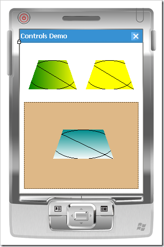
Placing a couple of these controls on a form, I can set one of them to use a solid background (yellow), and the others to use vertical and horizontal linear gradients.

Linear Gradient Control Screenshot

Conclusion

Linear gradients are a great effect to have in your repertoire of techniques.  Compact Framework applications especially tend to be flat and dull, with an unimpressive array of built-in controls, and with more focus on user interfaces like the iPhone and some of the cool new HTC touch devices, the desire for fancier interfaces is growing.  As we start to mix operations like polygon clipping and quasi-transparency (presented in the previous article), linear gradients, and others, we can put together a bag of tricks for composing beautiful and interesting user experiences.

Posted in Algorithms, Compact Framework, Custom Controls, User Interface Design, Windows Forms | 9 Comments »

Compact Framework Controls (Part 2): Polygon Clipping

Posted by Dan Vanderboom on May 4, 2008

[This article is part of a series that starts in this article.]

My intention is to cover a full spectrum of activities around custom control development, with an emphasis on the compromises, workarounds, and special care that must be taken when developing controls for the Compact Framework.  In my first article, I talked about how most design-time attributes must be applied to control classes and their members, and what some of those attributes mean.  I have a number of articles planned that explore those attributes more, and will go into extending the design-time experience in more depth, but I’m going to take a detour into custom painting of the control surface first, so we have a control to reference and work with in the examples.

Polygon Clipping

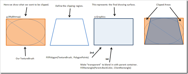
If you’re new to creating graphical effects and unfamiliar with the techniques invovlved, clipping refers to the chopping off of an image based on some kind of border or boundary.  In Windows Forms interfaces, controls are inherently rectangular because clipping occurs automatically at the window’s boundary (which is a shame considering how this presumption of need slows rendering, and WPF takes good advantage of not doing so).  Everything outside the control’s outer shape doesn’t get drawn at all.  You can draw anywhere you want, including negative coordinates, but only the points that fall within the clipping region will be displayed.

Clipping Illustration

But what if you want to make your control a different shape, other than the standard rectangle, like an ellipse or a rounded rectangle?  How do you make sure that whatever you draw inside never leaks outside of your defined shape?  In the full .NET Framework, there is a Region property in the Control class that defines these boundaries, and there are several good articles that explain this.  The clipping mask is applied based on that Region’s definition.  In Compact Framework, the Region property doesn’t exist, and you’re forced to find your own way of defining different shapes.

The key to this is to understand the Graphics class’s Fill methods.  While FillEllipse and FillRectangle definitely have their uses, I’d like to focus on situations that are a little bit more demanding, such as when you want to represent a more complex shape like a rounded rectangle (with many points) or some kind of UML diagram element.  FillPolygon takes a list of Points, and with them can define the most eccentric and specific of shapes.  By filling a polygon with an image using a TextureBrush, clipping happens automatically as part of the operation.

Let’s take a look at some code to see how we perform each of these steps: preparing and drawing on a bitmap image in memory, defining our shape’s boundaries, and then clipping that image within the specified shape.

using System;
using System.Collections.Generic;
using System.Windows.Forms;
using System.Drawing;
using System.Reflection;

namespace CustomControlsDemo
{
    public class ClippingControl : Control
    {
        protected override void OnPaint(PaintEventArgs e)
        {
            // define a canvas for the visual content of the control
            Bitmap MyBitmap = new Bitmap(Width, Height);

            // create a painting tools object
            Graphics g = Graphics.FromImage(MyBitmap);

            // draw graphics on our bitmap
            g.FillRectangle(new SolidBrush(Color.PaleGoldenrod), ClientRectangle);
            g.DrawLine(new Pen(Color.Black), 0, 0, Width - 1, Height - 1);
            g.DrawEllipse(new Pen(Color.Black), 0, 0, Width - 1, Height - 1);

            // dispose of the painting tools
            g.Dispose();

            // define the custom shape of the control: a trapezoid in this example
            List<Point> Points = new List<Point>();
            Points.AddRange(new Point[] { new Point(20, 0), new Point(Width - 21, 0), 
                new Point(Width - 1, Height - 1), new Point(0, Height - 1) });

            // draw that content inside our defined shape, clipping everything that falls outside of the region;
            // only if the image is much smaller than the control does it really get "tiled" and act like a textured painting brush
            // but our bitmap image is the same size as the control, so we're just taking advantage of clipping
            Brush ImageBrush = new TextureBrush(MyBitmap);
            e.Graphics.FillPolygon(ImageBrush, Points.ToArray());
        }
    }
}

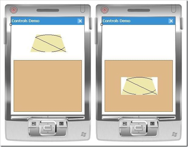
Although this control has a silly shape and doesn’t do much yet, it does illustrate the basics of painting within the bounds of an irregular shape.  As long as we draw on MyBitmap, everything will be properly clipped by the call to FillPolygon.  However, as you can see in the screenshots below, the white background around our custom shape could be a problem.  You can change the BackColor property to match the color of the container its on (a Panel control in this case, which is Color.BurlyWood), but really it makes more sense for BackColor to describe the color within our shape.  We’d like the surrounding background to blend in with whatever container the control is sitting in.

first version

We can accomplish this with two simple changes.  First, at some point before the FillPolygon call, we need to fill the entire control’s area with the BackColor property of the parent control.  We will draw using the e.Graphics object, which paints on the whole rectangular control, not our g Graphics object, whose contents get clipped.  Then, instead of hard coding Color.PaleGodenrod, we can use the BackColor property to specify our fill color.  Here is the changed section of code:

// draw graphics on our bitmap
g.FillRectangle(new SolidBrush(BackColor), ClientRectangle);
g.DrawLine(new Pen(Color.Black), 0, 0, Width - 1, Height - 1);
g.DrawEllipse(new Pen(Color.Black), 0, 0, Width - 1, Height - 1);

// dispose of the painting tools
g.Dispose();

e.Graphics.FillRectangle(new SolidBrush(Parent.BackColor), ClientRectangle);

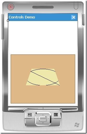
Now if we set the BackColor to PaleGodenrod, we’ll get this rendering:

transparent background

Dragging the control off the panel and into the white area will cause the area around the control to paint white, so now you can see how it blends in with whatever background we have as long as it’s a solid color.

In a future article, after I’ve covered how to draw arcs and curves, I will revisit this technique and demonstrate how to draw rectangles with rounded corners.

[This article is part of a series that continues in this article.]

Posted in Algorithms, Compact Framework, Custom Controls, User Interface Design, Visual Studio, Windows Forms, Windows Mobile | 12 Comments »

Phidgets Robotics Programming in C#

Posted by Dan Vanderboom on April 21, 2008

Download the Source

Bridgeware is the word you need to know for rapidly prototyping electronics and robotics.  These components bridge programs running on computers with electronic components such as sensors and motors.  There’s a good video about it by Trossen Robotics on You Tube.  I bought my components from Trossen Robotics online and I recommend them (they have a number of how-to videos).

Day 1

I got my Phidgets components in the mail, and went right to work assembling my pan-tilt camera mount, controlled with two servos from a controller board, and connected to my laptop from there by a USB cable.  A tiny allen wrench was included, but not a phillips screwdriver, which you will also need.  You can see the components assembled and connected in the picture below.

Photo of robotics components

The black thing in the back right corner is just a USB hub.  This is connected to (on the right) an 8/8/8 controller (with lots of room for more components to plug in), and then to the mini joystick.  The other USB connector plugs into a 4-servo controller, and then to the dual servos in the pan-tilt assembly in the back left of the picture.

On the software side, using the Phidgets .NET API was very easy.  Just instantiate a Servo object, provide an event handler to run when a device is attached, and from there I was able to set each servo position or read the position back.  The only confusing part was realizing that the servo controller board is represented by the Servo class, and the individual servos plugged into that controller are represented by the ServoServo class.  (Was this API written in Bora Bora, perhaps?)  I would have named them ServoController and Servo, respectively, but I got over it and moved on.

What you see visualized in the test application (see screenshot below) is a coordinate graph custom control that displays the position of both servos.  When I hooked up the mini joystick, I made the mistake of mapping the joystick position to the graph, but then realized that my graph would be useless unless I was controlling everything with the joystick.  I wanted to script out servo movements and replay the sequences and still have their position represented in the coordinate graph control, so I made that update (and ever since have been unable to calibrate the system to center itself).

image

Hooking up the hardware took only 15 minutes, and most of the application involving the Phidgets API took an hour or two at the most, but I spent the rest of the day creating the custom graph control and getting it to translate coordinate systems correctly.  The joystick maps values from 0 to 1000 along each axis, the servos have a servo position range of -22 to 232 on one axis and something close to that on the other, and the graph control was 150 pixels wide.  I made it general enough to work with any coordinate ranges on both axes.

First Impressions

I have to say that it’s really cool to see physical objects interacting with software that you write yourself.  (It reminds me of fun I had with a hydraulic robotic arm I programmed in high school using an Apple 2c and low-level calls to the parallel port, but this is way more powerful).  The bridgeware components are easy to connect, and the APIs are a breeze to use.  Building the intelligence between inputs and outputs, however, is the really fun and challenging part.  Even though this initial experiement was simple, I can already tell that coordinating a much more complicated set of inputs and outputs will require careful planning and the use of tools such as Microsoft Robotics Studio, which include the Concurrency & Coordination Runtime and Decentralized Software Services Protocol.

Now that I’ve gotten my feet wet and have some confidence that I can build, connect, and interface with these components (and have a box full of other goodies like 3-axis accelerometers, light and temperature sensors, sliders, buttons, and switches), I have a bunch of ideas for at least one cool summer project that I hope to announce in the next month or two.

Posted in Custom Controls, Microsoft Robotics Studio, My Software | 10 Comments »

Visual Studio Build Bug in CF Controls Project using Generics

Posted by Dan Vanderboom on April 21, 2008

So there I was, minding my own business, creating some custom controls in a reusable framework project.  I needed to apply some design-time attributes, and because I’m working with Compact Framework, I attempted to add my DesignTimeAttributes.xtma file to accomplish this, which I’ve done many times before.

Bang!  I got an error message: “genasm.exe has encountered a problem and needs to close.  We are sorry for the inconvenience.”  In the task list was this error: “Process is terminated due to StackOverflowException.”  Stack overflow?!

I checked (and checked again) to make sure that my .xtma file was properly formatted, which it was, and I simplified it to include only a single DesktopCompatible attribute; being a boolean, I figured it was hard to mess that up (compared to something trickier like a Designer attribute).  But alas, I was stumped, and for the past week or two gave up and went without the attributes in that project, putting the majority of my controls in a separate project.

Today I decided I was on the mission of isolating the problem and getting to the bottom of this.  While I don’t know the root cause (I’ve submitted a bug report to Microsoft), I can reproduce the problem and describe the pitfall so some poor soul can find it while Googling for help.

It happens in Compact Framework projects.  To reproduce it, create a CF 3.5 project (I chose class library), and add a file with the following code:

public class atree<T> where T : atree<T>
{
} 

public class btree : atree<btree>
{
}


Note that if these classes are changed from public to internal, the problem disappears.

Then add a DesignTimeAttributes.xtma file, change nothing in it, and try to build.  Mine looks like this:

<?xml version="1.0" encoding="utf-16"?>
<Classes xmlns="http://schemas.microsoft.com/VisualStudio/2004/03/SmartDevices/XMTA.xsd">
</Classes>


That’s it, and I get the nasty errors described above.  I’m really curious to know what genasm.exe is doing, how it’s using some recursive algorithm to examine somewhat self-referencing generic definitions (I admit that the generics constraint in the code above is a bit on the odd side).

Posted in Compact Framework, Custom Controls, Visual Studio | 7 Comments »

Compact Framework Controls (Part 1): Creating Custom Controls and Designers

Posted by Dan Vanderboom on March 14, 2008

I’ve been having a lot of fun learning how to create rich design-time experiences for custom controls in Compact Framework for the past few days.  It’s been frustrating, and the documentation is hard to find unless you’re already familiar with the metaphors and know the buzzwords.  While this first article won’t be completely comprehensive, I will continue to write about this topic until I have covered all of the bases necessary for you to create professional, polished controls and design-time experiences suitable for commercial use or sale.

I’m going to assume you have at least some experience in creating custom controls, at least for desktop applications.  Creating custom controls for Compact Framework applications is another story, however.  Not because of any particular constraints of memory of screen real estate, but because the typical method for attaching metadata to specify design-time behavior is different.  There are some other subtleties and oddness as well that are specific to the Compact Framework.

In the full .NET Framework, we have many attributes at our disposal to specify design-time behavior; most of these can be found in System.ComponentModel.  We have access to a lot of these for mobile device applications, but because they’re not included in the Compact Framework, we need another way to associate them with our control classes and their members.  This is done through something called the “design-time attributes file”, which has an extension of .xtma.

There are two ways to add this file.  The method that people typically suggest is to add a class diagram to your project (right-click on your project in Solution Explorer, and select View Class Diagram), select an item in the diagram, edit the Custom Attributes property in the property grid (see screenshot below), click on the ellipsis (…) to open a pop-up window, and then enter an attribute such as DesktopCompatible(true).

Custom Attributes in properties

When you click the OK button, a new file will be added to your project called DesignTimeAttributes.xtma, and this file will open in Visual Studio.

This is quite a round-about way to create the file in my opinion, and it presumes that you know a valid attribute to add right from the beginning.  I personally don’t use the class diagrams, and I think it’s easier just to add the .xtma file directly, by right-clicking on your project in Solution Explorer, Add—New Item, and selecting Design-Time Attribute File.  Editing your attributes directly in this XML file instead of the pop-up window in the class designer has the benefit of providing you with some Intellisense (which it gets from the associated XSD file).

I get a little disappointed when I see people list only the most common attributes that I already know about, and then fail to mention the rest of the attributes that are supported in Compact Framework, and since the list isn’t unmanagable—and easily determined from Intellisense—I will list most of them that are supported .xtma file here, and in a future artile will provide the remaining ones.

Here’s a screenshot showing the full list of tags that you can use at the class level.  Most of them are attributes, while some of them like Event, Method, and Property allow you to specify specific members of the class so that you can apply attributes to just those members.

 Xtma attributes

This is what they mean:

  • ApplyDeviceDefaults – I couldn’t find any mention of this in the normal area of MSDN that enumerates all of the classes, but I did find it explained well in this MSDN article.
  • ComplexBindingProperties – For complex data binding, of course.
  • DefaultBindingProperty – This is for simple data binding.
  • DefaultEvent – The default event for Button is Click.  When you double-click on a control in the designer, Visual Studio switches to the code behind file and will automatically generate this event’s handler for you.  Very handy.
  • DefaultProperty – When you select a control in the designer, this is the property in the properties window that gets focus first.  For the Label control, this is the Caption property.
  • Description – The description text appears in the properties window below the grid of property names and values, and can provide useful information about the meaning of a property or event.
  • Designer – The Designer attribute is one of the primary gateways for providing rich design-time experiences for your controls.  Creating custom designers and associating your controls with them is a tricky business, and one I intend to explore in depth in this and future articles.  Because MSDN documentation in this area is rather sparse, I’ve begun contributing to the community content on the MSDN pages, and you’ll see the help I’ve added at the very bottom of the page if you follow the link for this item.
  • DesignerSerializer – Located in System.ComponentModel.Design.Serialization, a DesignerSerializer is used to provide a custom way of serializing your control to code in the designer partial class file.  I haven’t had a need yet to use this, but if someone can think of a real-world scenario that requires it, I will be happy to explore the subject further and write about it.
  • DesignTimeVisible – Indicates whether a control can be shown on a designer, and is supposedly ignored by “components with a UI presense”, whatever that means.  A little more usefully, MSDN states that it is useful when you have a control that accepts child components, such as the TreeView whose node items “should not appear in the component tray because they are drawn by the TreeView control”.  This will require some more exploration.
  • DesktopCompatible – This is the first design-time attribute I became familiar with in working with Compact Framework controls.  If you have a control that makes P/Invoke calls, Visual Studio is uncertain whether they’re device specific OS calls, and to be safe, it doesn’t execute your control’s code, which means your control can’t render itself even on the designer surface.  You get a message telling you that it’s unsafe.  To get around this, and presuming that it is indeed safe to run your control’s code on the desktop (I’ll explain more about this later, or you can read this article by XinYan), just add a DesktopCompatible attribute to the control class, and you’ll be back in business.  I’m not sure where this attribute is located; it’s not a desktop attribute, so it’s not in the full .NET Framework’s System.dll, and a search through Reflector didn’t locate it, so I’ll have to keep looking.  But it’s there, and it works.
  • Docking – Specifies the default docking behavior for controls.  This is located in System.Windows.Forms.
  • Editor – If you need a more powerful experience for editing complex properties within the properties window itself, this attribute will allow you to hook into one.  I’ll be covering over custom editors in detail.
  • ImmutableObject – Specifies that an object has no subproperties capable of being edited, per MSDN documentation.  Not sure what the benefits of that would be: perhaps to hide all properties for a class without having to hide each one separately?
  • InitializationEvent – This is used to support auto data-binding (by Visual Studio wizards I’m guessing), so it knows which event to hook into when generating the data-binding code.
  • LookupBindingProperties
  • RootDesignerSerializer – I’m not sure what this was for originally, but according to bug report, this attribute is both deprecated and broken.
  • Supported – Explained in this blog as part of Platform Verification Task.  Located in Microsoft.CompactFramework.Build.Tasks.  You can use this attribute to indicate that a class or member is not supported for the specific platform.
  • SuppressFiltering – Located in Microsoft.CompactFramework.Build.Tasks.
  • ToolboxBitmap – This simply specifies the bitmap that will be displayed in the toolbox.  Located in System.Drawing.
  • TypeConverter – Specifies the TypeConverter class used for a property.  TypeConverters are an important aspect of the design-time experience and merit further explanation.
  • Browsable – This determines whether a property or event will be displayed in the properties window, and is typically used to hide properties or events that must be public for some reason but aren’t meant to be manipulated during design time.
  • Category – If you set this to an existing category name, your property or event will appear in there; if you create your own category name, a new category will appear in the properties window.

There are a few more that are specific to properties, events, and methods, but this will give us a good start.  I’ll cover the remainder in future articles.

That seems like a lot at first glance, but chances are that you’ll only need a handful at any given time.  With a little exploration and practice (and guidance from myself and others whose blogs and other resources I’ll share), you could soon be a master of rich, no-compromise custom control development for Compact Framework applications.  I believe this is a worthy cause, for one because there is a scarcity of good third-party controls, especially when compared to the abundance that we have for the desktop world of .NET development; but also because I have personally struggled with Compact Framework development and have always thought it would be nice to have a step-by-step series of tutorial to follow for creating custom controls.  I’ve found many useful and helpful articles, but nothing that really brings it all together in a clear manner.

Here is an example .xtma file for a new user control I created that has Category and Description attributes on a property I created called HighlightForeColor:

XTMA

The magic happens when you build your custom control project.  Visual Studio builds not only your control project in its runtime form, but also generates another assembly with .asmmeta.dll after your own target assembly name.

Build output

If you use Reflector to disassemble it, you will see that this is a design-time component that contains all of your classes and their members with real attributes attached.  Strangely, it does not contain any code, and parameters have no names.  The purpose is simply to be a carrier of attributes.  This is a screen shot from Reflector, showing the attached attributes:

Reflector

I’m puzzled by this implementation detail.  Attributes are so insignificant in size, being just metadata tags.  If Microsoft had just included them in the Compact Framework, it seems they could have avoided the requirement for this second, oddly-empty assembly (and there is a third, for custom designers and editors, as you’ll see later).  Unless there’s something else to it that I’m missing…

[This article is part of a series that continues in this article.]

Posted in Compact Framework, Custom Controls, User Interface Design, Visual Studio, Windows Forms, Windows Mobile | 10 Comments »